Project summary
This project aimed to create a user-friendly website and app called Orangutan Salvation.To achieve this, I conducted thorough research, analysed competitors, and created user personas. I designed clear information architecture, wireframes, the logo and high-fidelity mockups. The design focused on a clean, visually appealing interface with clear calls to action & story telling. I also conducted usability testing, along with early prototypes and ensured accessibility compliance. The goal was to increase donations, adoptions, and volunteer sign-ups.
Margin 16p
Distance 16p
Distance 16p
Distance 240p
Distance 72p
Margin 16p
Distance 4p
Distance 32p
Distance 24p
Distance 32p
Home screen
Headings
Text
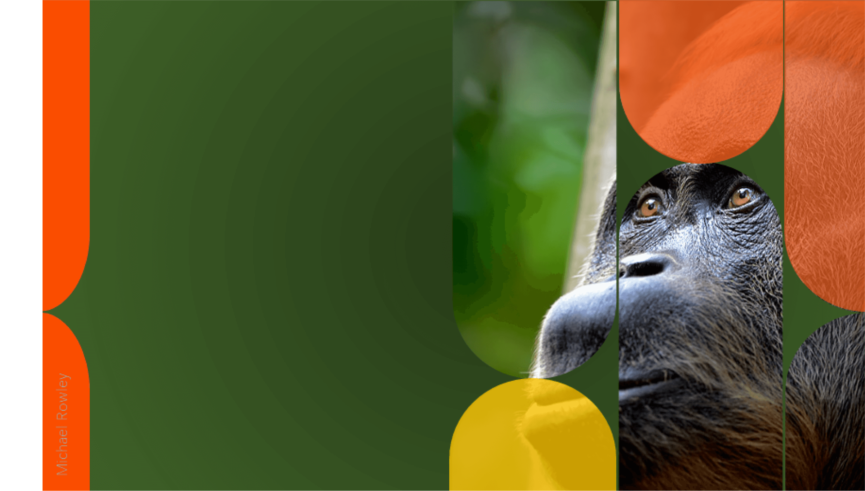
Orangutan Salvation
for social good
CHARITY APP & WEBSITE CASE STUDY
Orangutan Salvation
A user experience for social good, including:
User research
competitive analysis
personas
site map
user flows
wireframes
mock-ups
hi-fidelity-ui
Alignment
usability study
accessibility evaluation
Where
London, England
Role
Designer, Researcher
What
Native
App & Website
Category
Conservation Charity
Why
Portfolio Project
When
Jan 2023 -
Feb 2023
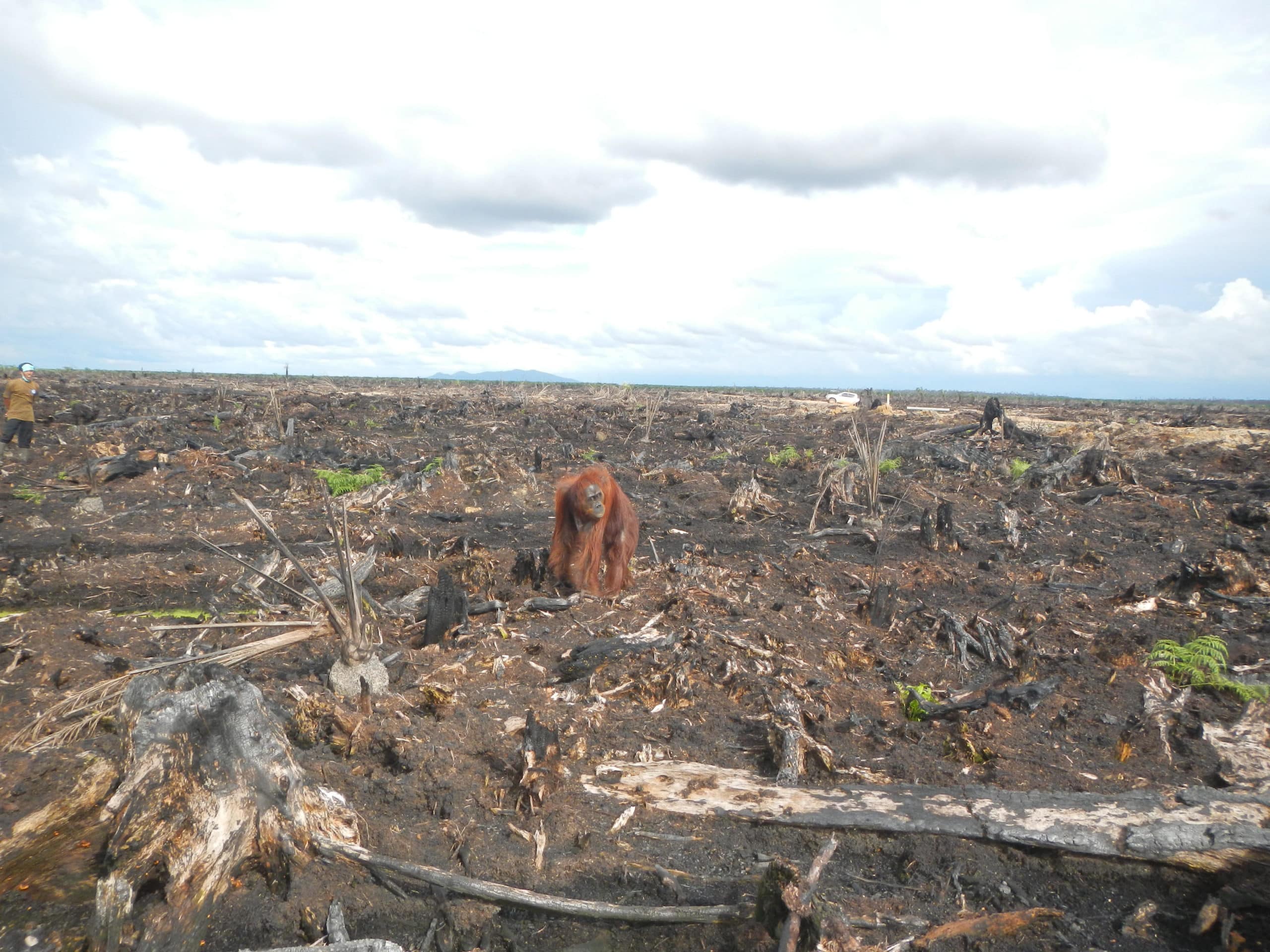
The reason behind the project
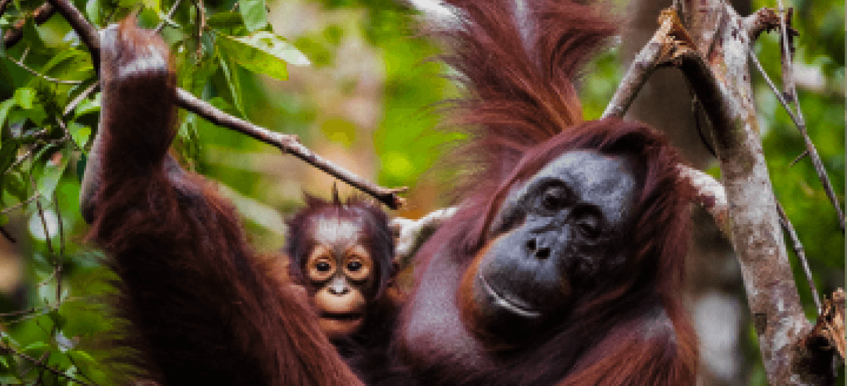
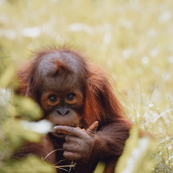
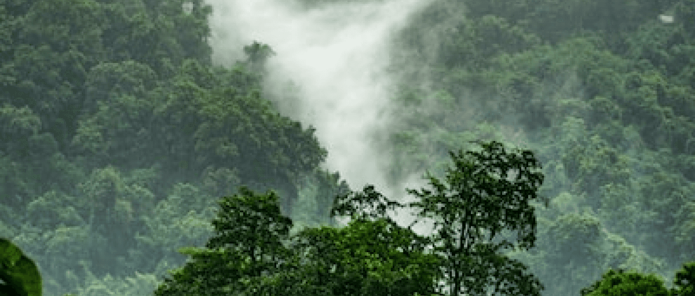
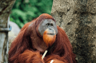
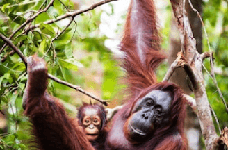
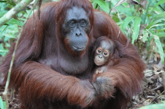
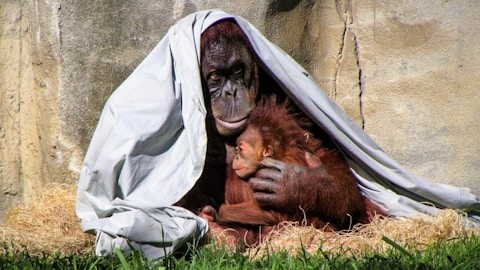
As a passionate advocate for orangutan conservation, I created Orangutan Salvation as It’s important to me that we make a tangible impact on their survival. The digital platform is designed primarily to Inspire Action: empower individuals to take action by donating, adopting, or volunteering.
Competitive Analysis
By conducting a comprehensive competitive analysis, Orangutan Salvation can gain valuable insights into the strengths and weaknesses of competing organizations' user experiences.
This analysis will enable the organization to identify opportunities for differentiation, such as improving website navigation, enhancing mobile responsiveness, and optimizing content for user engagement.
Ultimately, these improvements will help Orangutan Salvation attract and retain a larger audience, driving increased donations and support for orangutan conservation.

Home
Screen
Adopt
Donate
Volunteer
Once the sitemap was established, I began creating low-fidelity wireframes of the main screens.
Next song
Porsche
LOGO
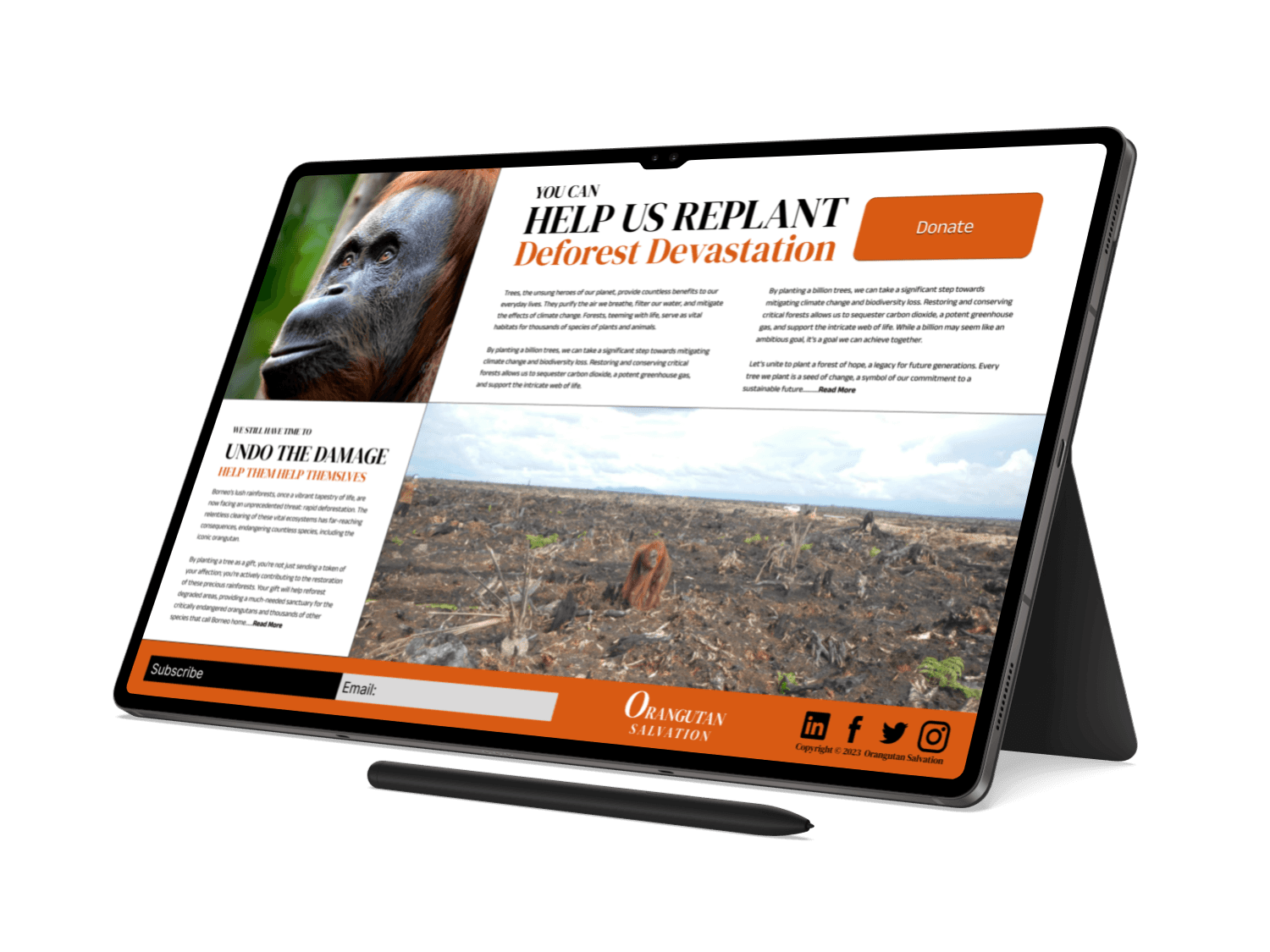
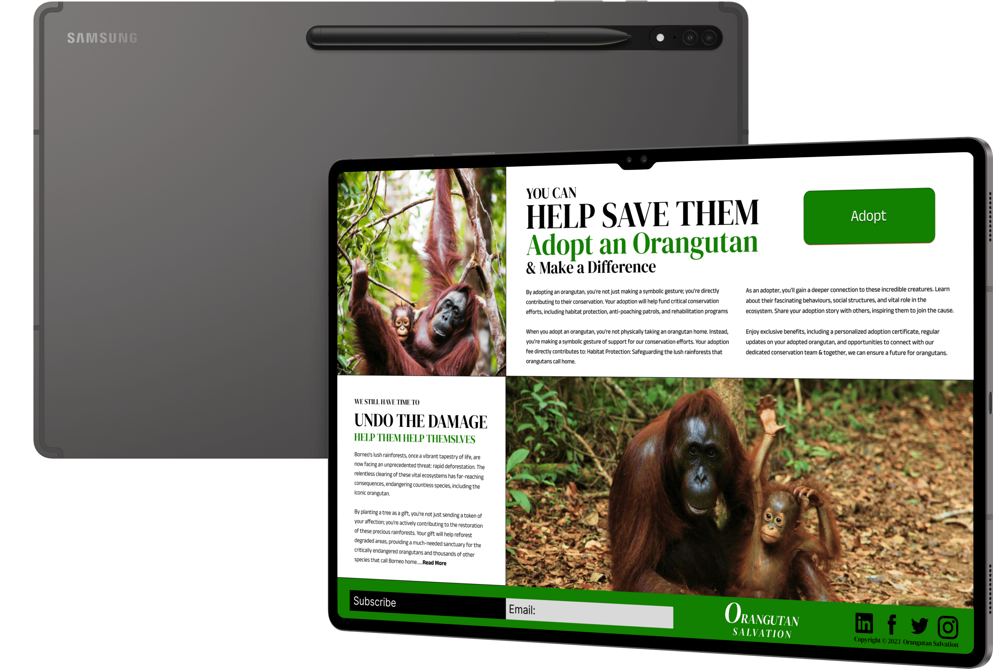
Here's how you can help
Help us replant
..........Read More
DONATE
Tree Graphic
Back
Adoption Process
Make a payment
Subscribe
LOGO
Back
Low-fidelity wireframes
High-fidelity Interface & Design direction
showinhomeg the sum of the parts
Design direction
Design choices
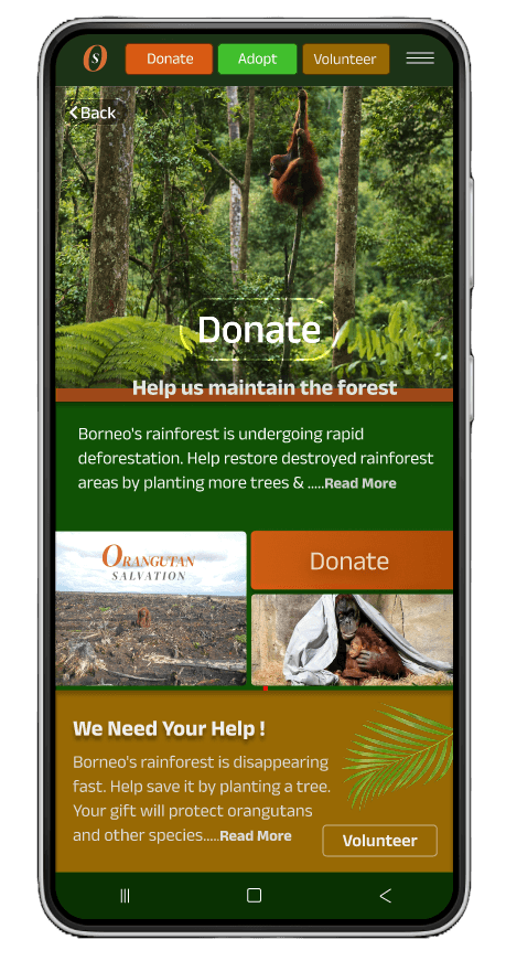
Donate Screen
clear CTA adopt button
payment button to adopt
success story
Adopt screen

Home screen
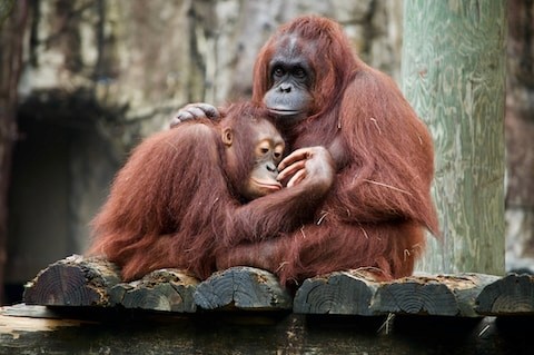
After finalizing the initial wireframe structure, I delved deeper into my research to develop a captivating design system. This system, composed of nature-inspired colours of greens and oranges and a vibrant style, to enhance the visual appeal of the Orangutan Salvation website and mobile app, drawing users in and aligning with the habitat of the Orangutan
User Research
To gain a comprehensive understanding of our target audience's needs, motivations, and behaviours, we conducted a series of in-depth interviews and a thorough competitive analysis.
This research enabled us to identify key user journeys and establish the need for a robust online presence.
By mapping out potential user interactions, such as donating, adopting an orangutan, or learning about our conservation efforts, we can ensure that our digital platform effectively meets the needs of our audience and drives meaningful impact
Strengths:
Clear Navigation: The website is easy to navigate, with clear categories and a prominent search bar.
Weaknesses:
Cluttered Homepage: The homepage can be overwhelming with too many calls to action.
Strengths:
Clear Navigation: The website is easy to navigate, with clear categories and a prominent search bar.
Weaknesses:
Cluttered Homepage: The homepage can be overwhelming with too many calls to action.
Strengths:
Clear Navigation: The website is easy to navigate, with clear categories and a prominent search bar.
Weaknesses:
Cluttered Homepage: The homepage can be overwhelming with too many calls to action.
Competitors

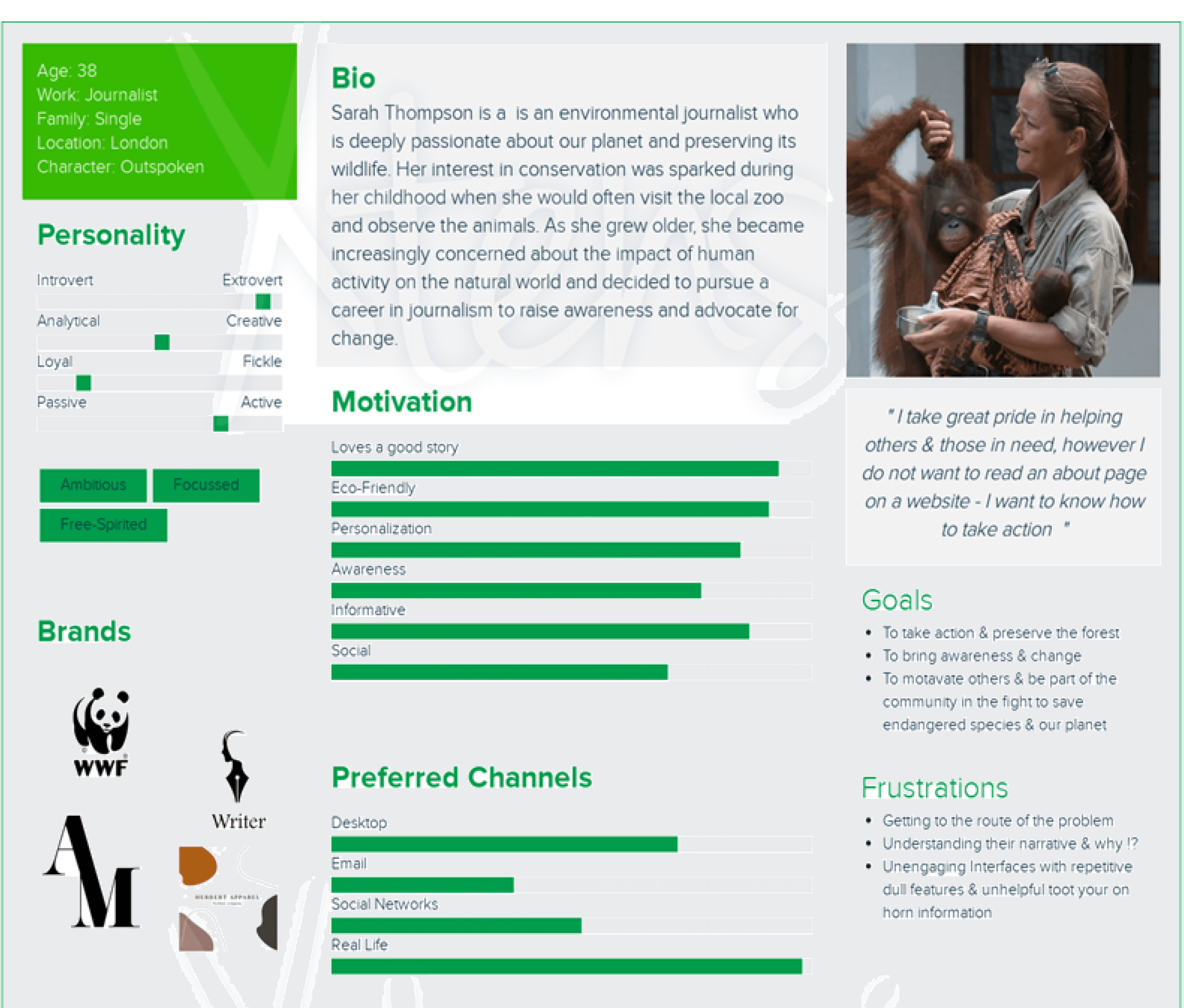
Persona:
Sarah Thompson
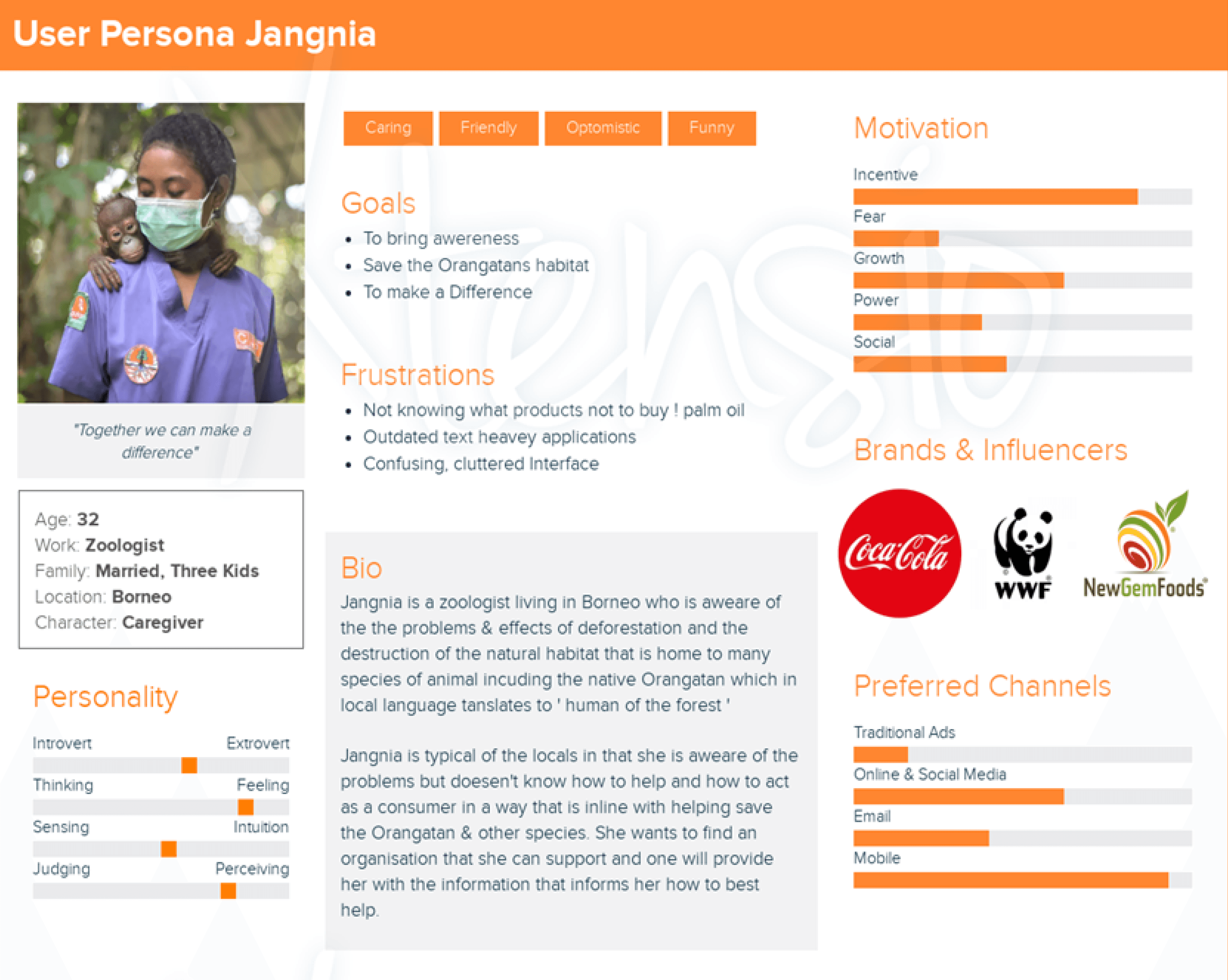
Persona:
Jangnia
Problem statement:
I take great pride in helping others & those in need, however I do not want to read an about page on a website – I want to know how to take action
Problem statement:
Jangnia explains that she is confused at times on what are good products and bad products & wants
more clarity to help her make informed decisions.

Released Orangutans
Raise Awareness
Rescue & Rehabilitation
Orphaned Updates
Business Supporter
One off Gift
View Orangutans
Events
Save The Forest
Orphaned Orangutans
Help Replant The Forest
Plant The Forest
This simplified sitemap showcases the three main ways to get involved in orangutan conservation: Donate, Adopt, and Volunteer. The website’s goal is to raise funds and rebuild orangutan habitats. By simplifying the user journey and reducing decision overload, the site aims to inspire visitor action.
While additional pages like Contact Us, About Us, Blogs, and News Stories offer valuable information and engaging content, they will be de-emphasized to prioritize the core actions.
Cancel
Car Location map
Porsche
Where did I park my Porsche...
Search & Find
video
Latest news
LOGO
message
Subscribe
Adopt
Get Involved


Sitemap diagram


Showing three screens of twenty wireframe designs
Colour Palette: Focus is on earthy tones like browns, greens, and oranges, with maybe pops of vibrant colours to represent the energy and diversity of the rainforest.
Typography: Thinking of using a clean, legible font that is both modern and organic. Considering a serif font for headings and a sans-serif font for body text.
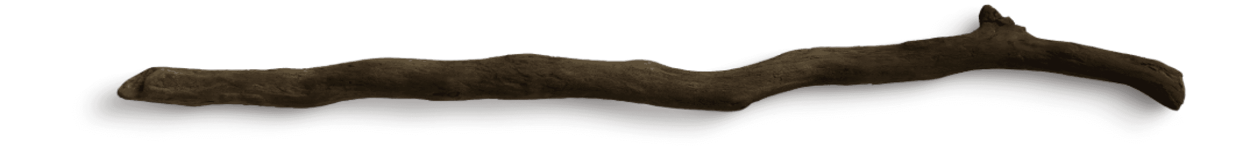
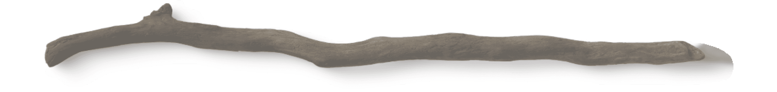
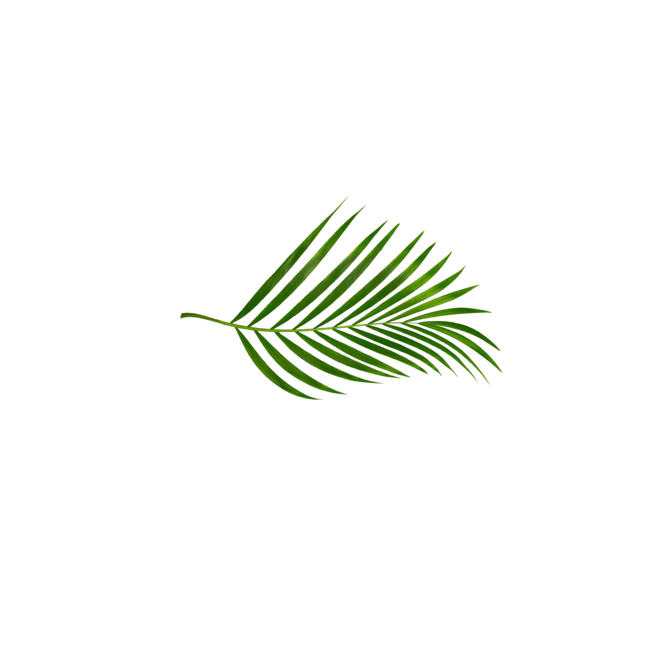
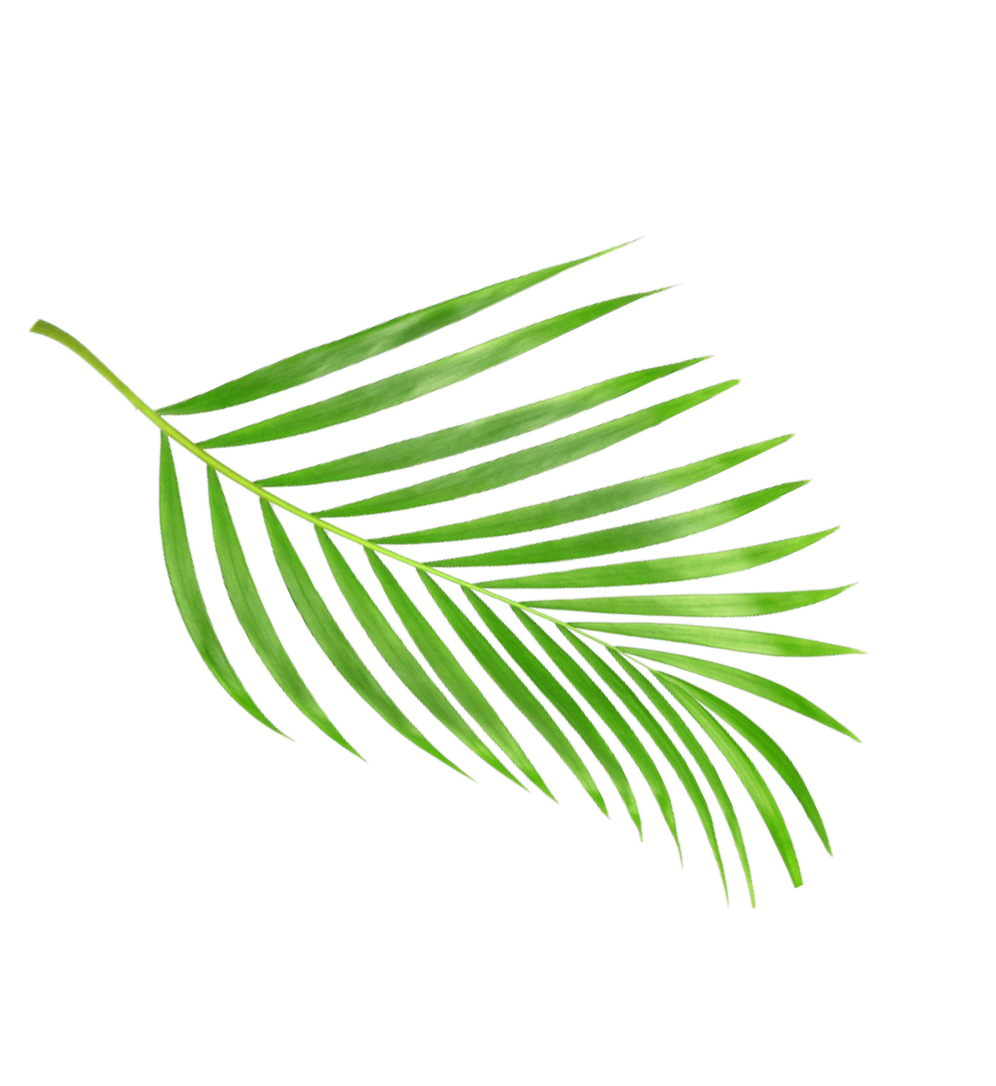
Imagery: Use high-quality images of orangutans in their natural habitat. Considering incorporating illustrations to add a playful touch, leaves , branches, trees etc

H1
Body
#D85A13
#41BF2D
#986904
Donate
Adopt
Volunteer
Navigation bar which is a component that
is used across multiple screens
Navigation bar remains accessible while scrolling
on various devices with built-in cameras
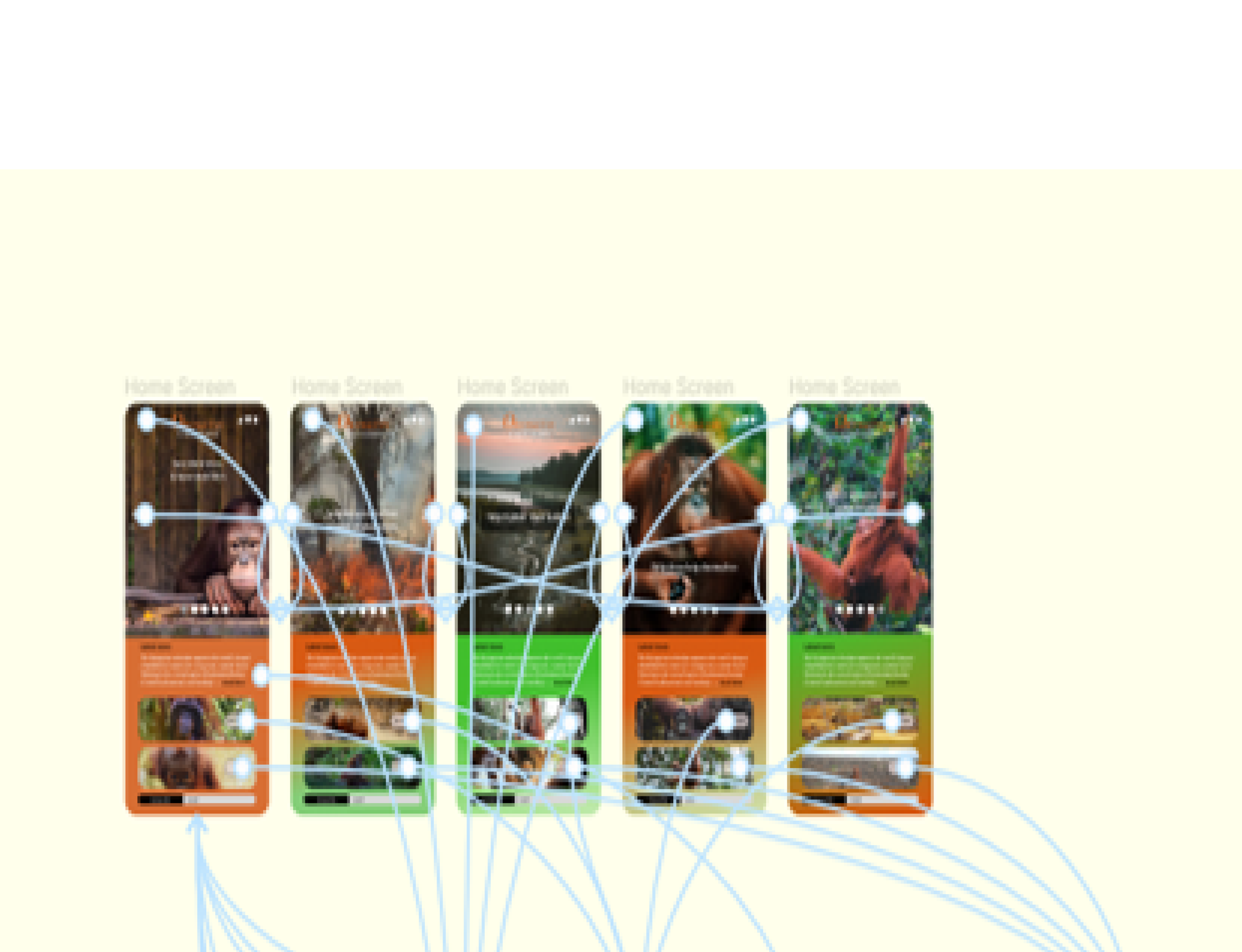
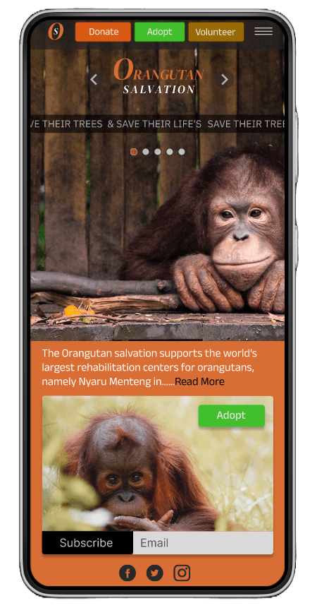
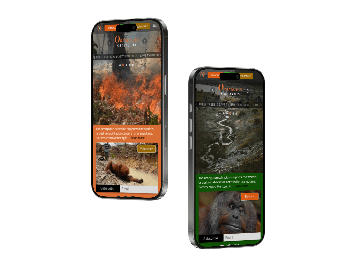
The immersive home screen unfolds a compelling
narrative through a continuous loop of five alternating
screens. Each screen paints a vivid picture of the
Orangutans' plight, showcasing the devastating
destruction of their natural habitat. Yet, it also offers a
glimmer of hope, visualizing the restoration
of their forest and the eventual return of these magnificent creaturesto the wild
The main body text is Anek Gujarati with different font sizes adapted for various screen & allowing for responsiveness design
and a better user experience across devices.
Accent colour for donate buttons to help differentiate choices,
between the three main CTA buttons. also used as a background
colour against the adopt button for contrast & impact
Accent colour used for adopt buttons & also used
as a background colour to help donate buttons
pop against a contrasted orange background .
Accent colour used to highlight Volunteer buttons, providing
clear visual cues for users interested in volunteering. All three accent
colours are inline with the Orangutan & its natural habitat.
Logo which is also the home screen button navigation
Home screen
Home screen
High-fidelity UI screens
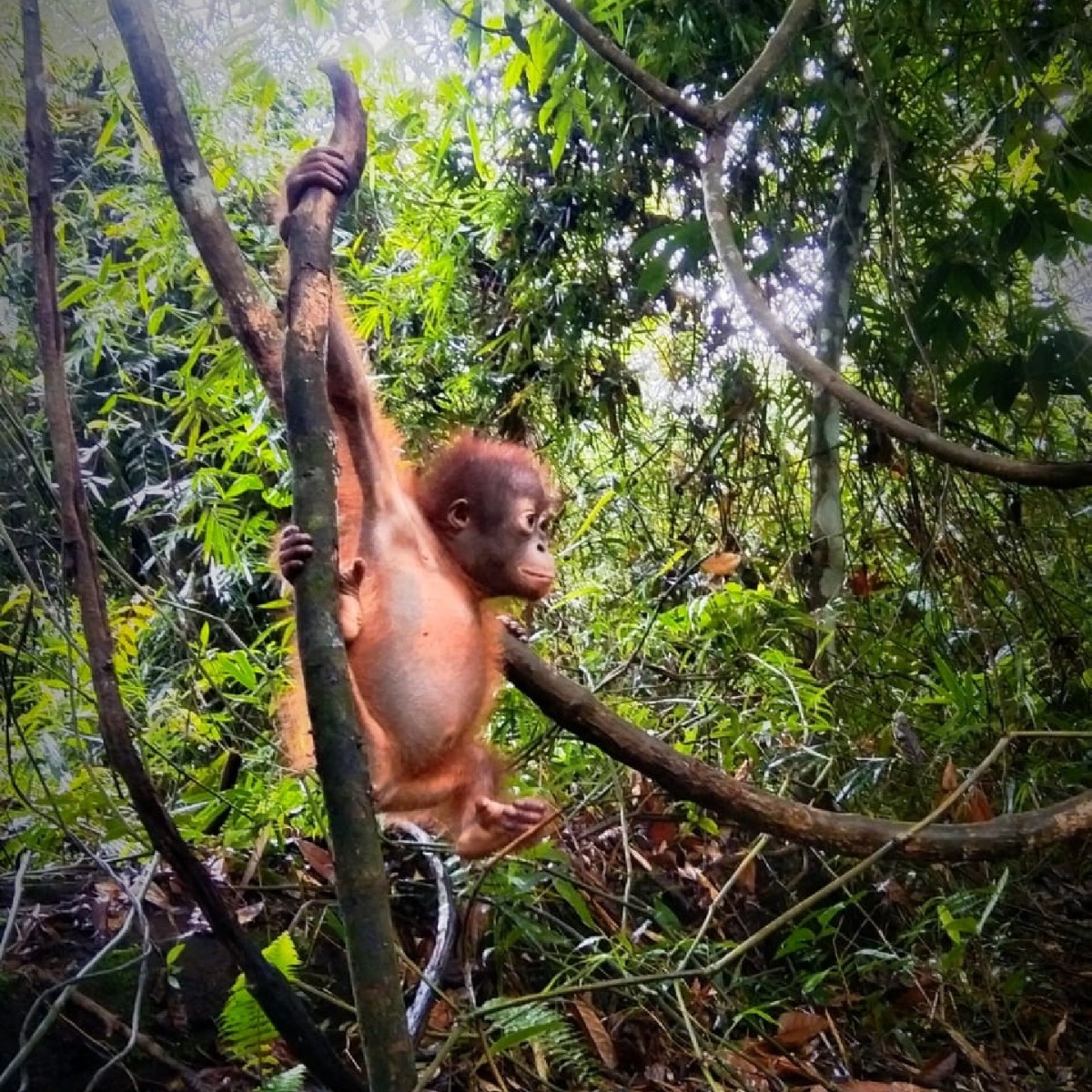
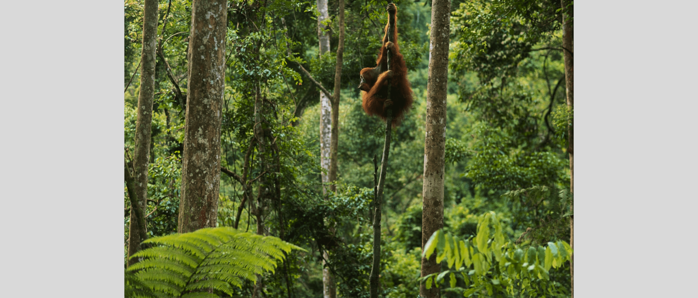
To create a powerful and emotionally resonant user experience, the home screen image or video loop will take viewers on a poignant journey through the challenges facing orangutans.
Over five impactful screens, we will visually narrate the heartbreaking reality of deforestation, habitat loss, and the declining orangutan population.
Each screen will be carefully designed to evoke empathy and inspire action.
High-quality visuals, such as stunning photographs and captivating videos, will immerse users in the world of orangutans. The use of colour, typography, and sound design will further enhance the emotional impact of the experience.
While highlighting the challenges, we will also shine a light on the hope and resilience of these extraordinary creatures. Through compelling storytelling and clear calls to action, we will showcase the organization's unwavering commitment to restoring their numbers and their natural habitat.
By engaging users on an emotional level, the aim is to motivate the user to support the mission and become active advocates for Orangutan Salvation.
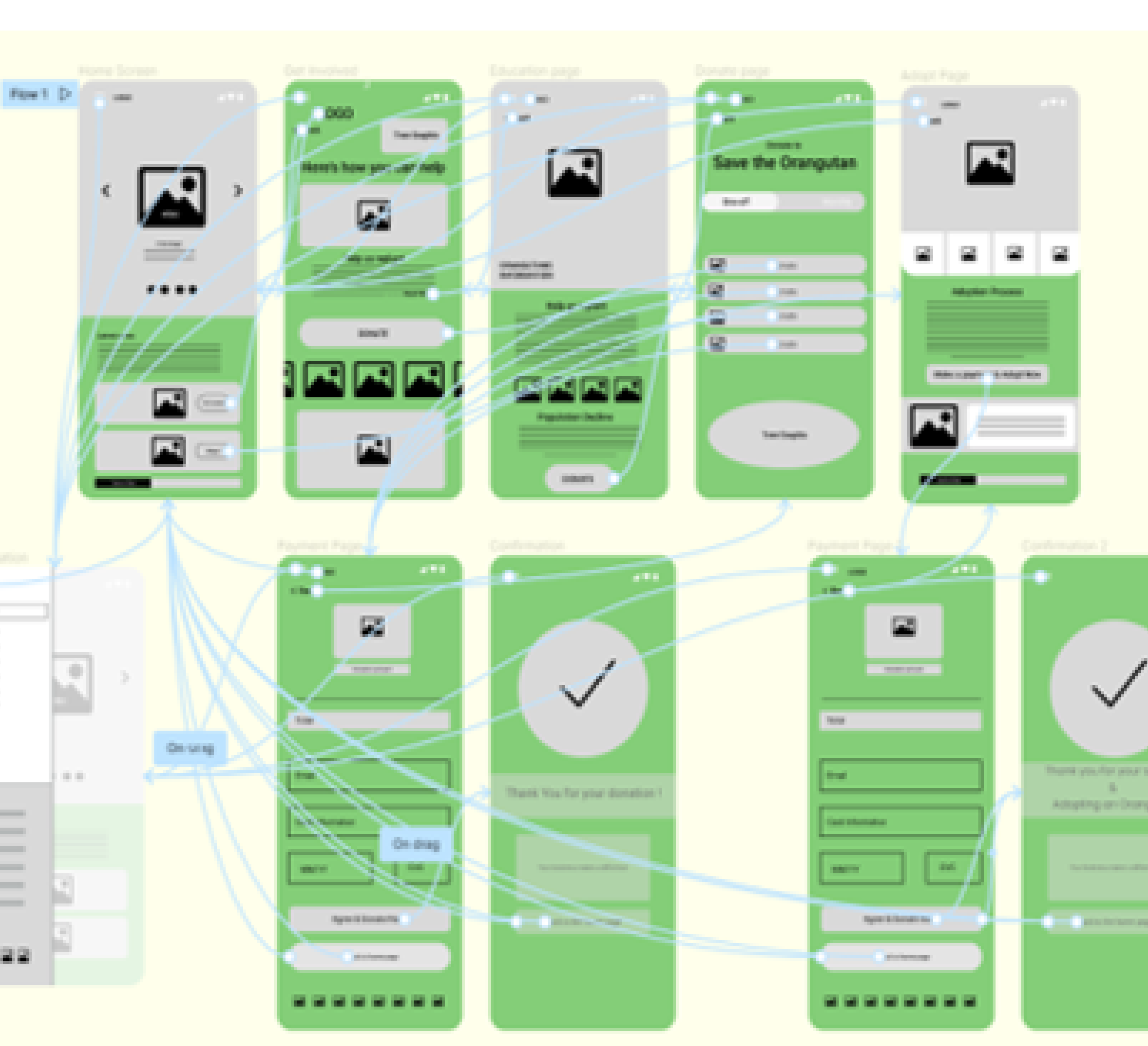
Twenty five high-fidelity screens were created
To optimize user experience, I included five home screens on a continuous loop: a tab bar and a hamburger menu were included for navigation. A/B testing will be conducted in later design stages to determine the optimal solution for user interaction and satisfaction.
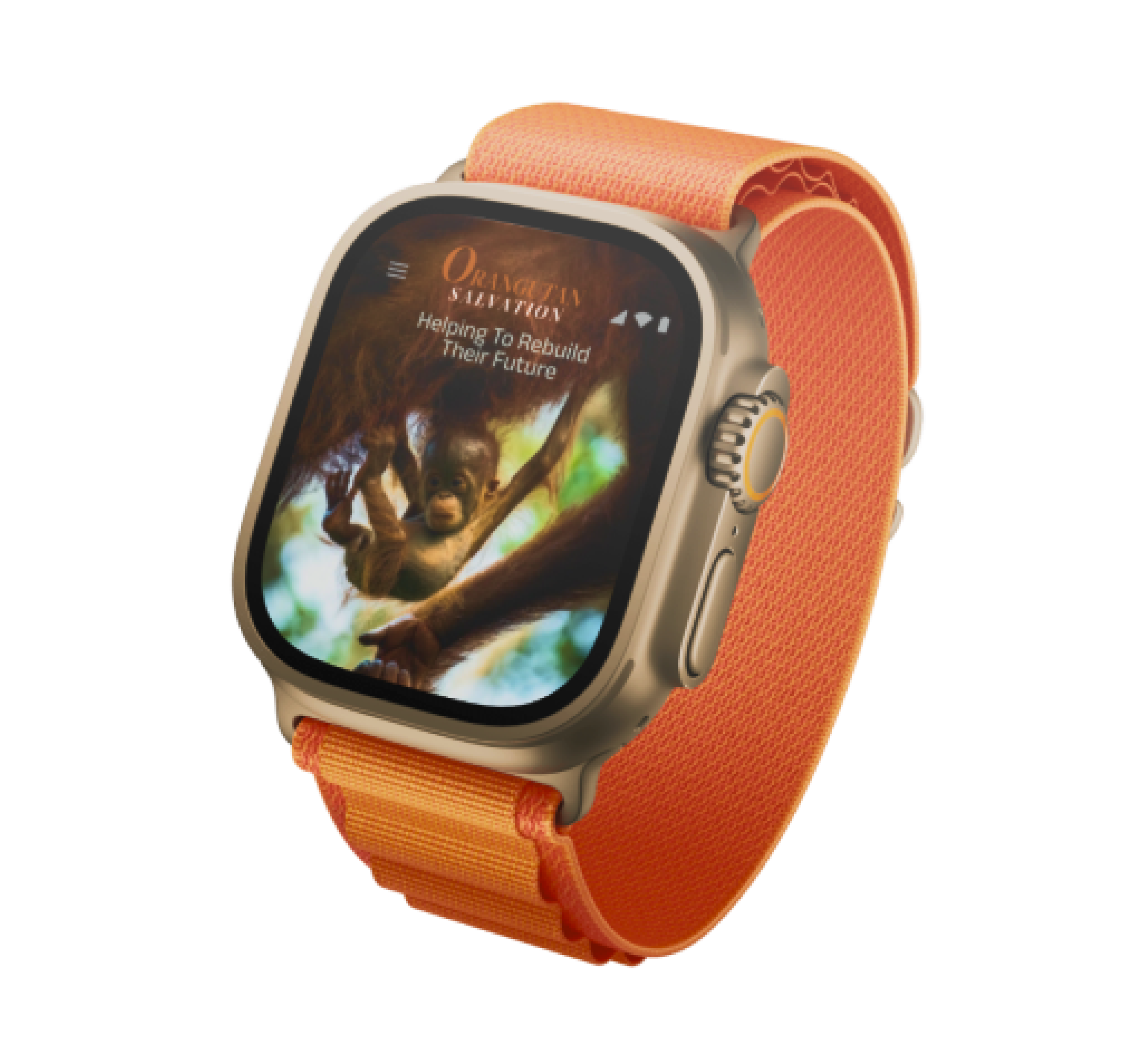
Users are guided on most screens with three clear calls to action (CTAs): Donate, Adopt, or Volunteer. These options encourage users to support Orangutan Salvation's efforts to repair and restore the orangutan habitat and ensure their survival. On smaller screens, such as Apple Watches, these options are accessible through a hamburger menu to optimize screen space.
User Interface
High-fidelity
Grid - Spacing
& Alignment
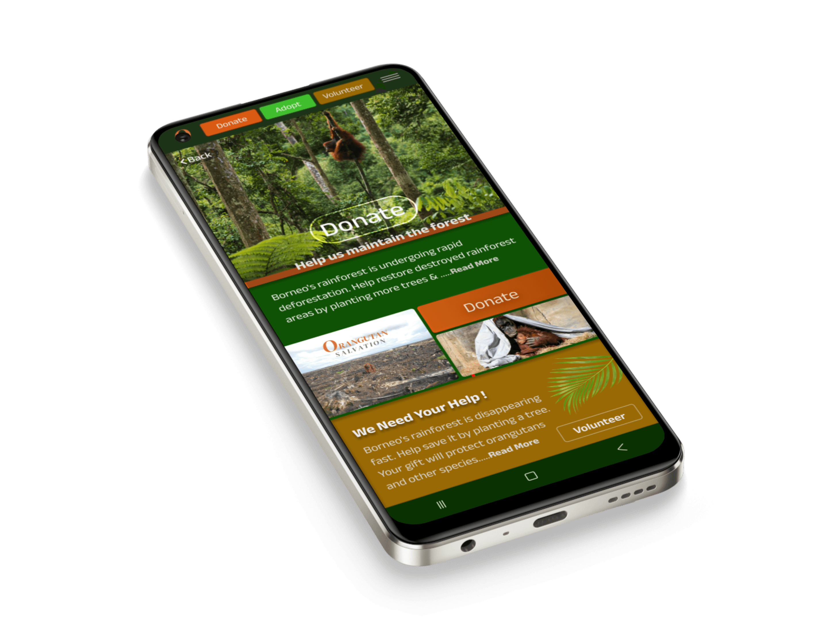
volunteer
Help us maintain the forest
O
S
Donate
Adopt
Volunteer
Back
Adopt
Borneo's rainforest is disappearing fast. Help save it by planting a tree. Your gift will protect orangutans and other species.....Read More
We Need Your Help !
Donate
Distance 8p
I employed a 4-column grid system with 16-point margins and 8-point gutters. This mobile-first approach allows for seamless scaling to 8-column and 12-column grids for tablet and desktop layouts, respectively.
Distance 16p
Touch target
bounding box
40x40p
Save their trees
& Save their life's
Latest news
Subscribe
ORANGUTAN
SALVATION
Get Involved
Adopt
The Orangutan salvation supports the world’s largest rehabilitation centers for orangutans, namely Nyaru Menteng in the central region of Indonesian Borneo (Central Kalimantan) and Samboja ......Read More
ORANGUTAN
SALVATION
Subscribe
Adopt
The Orangutan salvation supports the world’s largest rehabilitation centers for orangutans, namely Nyaru Menteng in......Read More
Save their trees & Save their life's
Volunteer
Save their trees & Save their life's
O
S

Donate
Adopt
Here's how you can help
Help us maintain the forest
DONATE
Back
ORANGUTAN
SALVATION
Borneo's rainforest is undergoing rapid deforestation. Help restore destroyed rainforest areas by planting trees as a gift to a friend or loved one. Your gift also contributes to securing a future home for the critically endangered orangutans and the thousands of other species that live in the rainforest of Borneo....Read More
Donate
Borneo's rainforest is undergoing rapid deforestation. Help restore destroyed rainforest areas by planting more trees & .....Read More
O
S
Donate
Adopt
Volunteer
Back
DONATE
ORANGUTAN
SALVATION
Volunteer
Borneo's rainforest is disappearing fast. Help save it by planting a tree. Your gift will protect orangutans and other species.....Read More
We Need Your Help !
Help us maintain the forest
Usability study
Old Home Screen
Old Donate Screen
New Home Screen
New Donate Screen
Initial prototyping and usability testing revealed significant difficulties in conveying the intended message and achieving the desired user interactions.
This led to a complete redesign, informed by early research, to prioritize core product features and create a more intuitive user experience.
The revised design emphasizes the primary actions of Donate, Adopt, and Volunteer, making them easily accessible.
Less critical options have been moved to a hamburger menu (mobile) or dropdown menus (tablet/desktop) to avoid cluttering the main interface
With a focus on user experience, we repositioned elements to improve the user flow and make interactions more intuitive.
By strategically using contrast and accent colours, we highlighted CTAs and provided clear visual cues, guiding users towards desired actions
New clear colour coded navigation butttons
Home logo button
Scrolling information tracker
The typeface and font of the body text was change
to a more readable sans typeface and larger font
Bad design choice of colours and poor use of negative space and image position
Element are not aligned or consistently spaced
Poor contrast and font was too small and difficult to read
Donate button proportion was not
balanced with the layout and was not connecting with the story being told
Here the Donate button is part of the story being told - that of the plight experienced by the Orangutan & then transitions into a separate section that instructs the user of the option to volunteer
To provide a more user-friendly experience, the mobile screen presents three clear donation options , avoiding information overload by making them part of the narrative.
The improved colour contrast and vector illustrations enhance readability and create a visually engaging design, guiding users towards their desired action.
Carousel lacked context
A larger full image was chosen to invoke emotion and a clear CTA to adopt or subscribe
The translucent Donate button, paired with the heading, subtly informs users of the site's purpose without distracting from the emotional impact of the image
To optimize the reading experience, we transitioned to a serif typeface and adjusted the font size. This change improves readability and reduces eye strain for users
Early Prototypes
Accessibility Considerations
To ensure the website and app designs were accessible, I incorporated accessibility checks from the start. I used tools like Stark and Colour Contrast Checker in Figma to assess colour contrast, keyboard navigation, and image alt text. I manually verified font size, readability, and touch target size. I considered users with disabilities, adhering to WCAG guidelines and using ARIA attributes when necessary.
I would also collaborate with developers to implement accessible solutions and continually review and updated the designs to maintain accessibility.
ORANGUTAN
SALVATION
=
Sufficient Contrast PASSED: The contrast between text, Icons and background colours now meet WCAG 2.1 AA standards.

User Experience
DM Serif Display